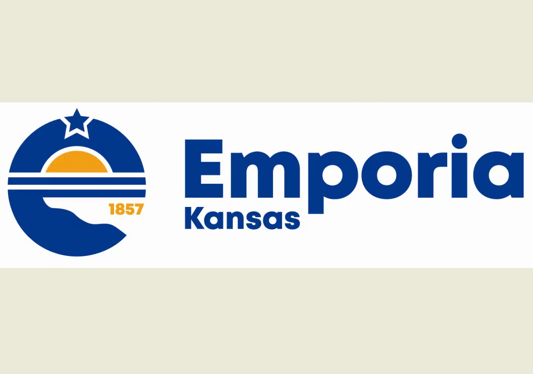
Emporia’s brand-new — and controversial — city logo has seen a minor adjustment.
The original logos unveiled Monday had a gold star near the top of the stylized E to represent veterans and Emporia’s status as the founding city of Veterans Day. After social media concerns from local veterans about the meaning of gold stars in the military — notably the Gold Star Mothers group for moms of soldiers killed in action — the city changed the star to a blue color.
Other aspects of the logo remain unchanged:
*The bottom of the E represents the Flint Hills and Emporia’s longstanding moniker of “Front Porch of the Flint Hills.”
*The two stripes in the middle of the E represent the Cottonwood and Neosho Rivers.
*The top half of the E is designed to represent the future.
Designed by Lot & Ilk, the new logos for official business replace the prior logo in place for over 15 years. The old logo resembled the “Kansas: As Big As You Think” tourism campaign from 2005. Residents posting to KVOE’s Facebook page have likened the new logo to the state of Colorado flag, Pac-Man or the Microsoft Internet Explorer logo.
KVOE News is concluding its KVOE.com Online Poll at 4 pm Friday, asking whether you approve of the new logo design. To vote in the poll, go to the KVOE.com home or news pages — near the top of the screen on the website, near the bottom of the screen on your cell phones. You can vote once per IP address per day.
Logos courtesy City of Emporia and Lot & Ilk.


